Flagler College
Major: Graphic Design
Minor: Advertising / Fine Art
Graduated Fall 2016
Proficent in Adobe CC:
Illustrator
InDesign
Photoshop
Portfolio
Some of my favorite projects.
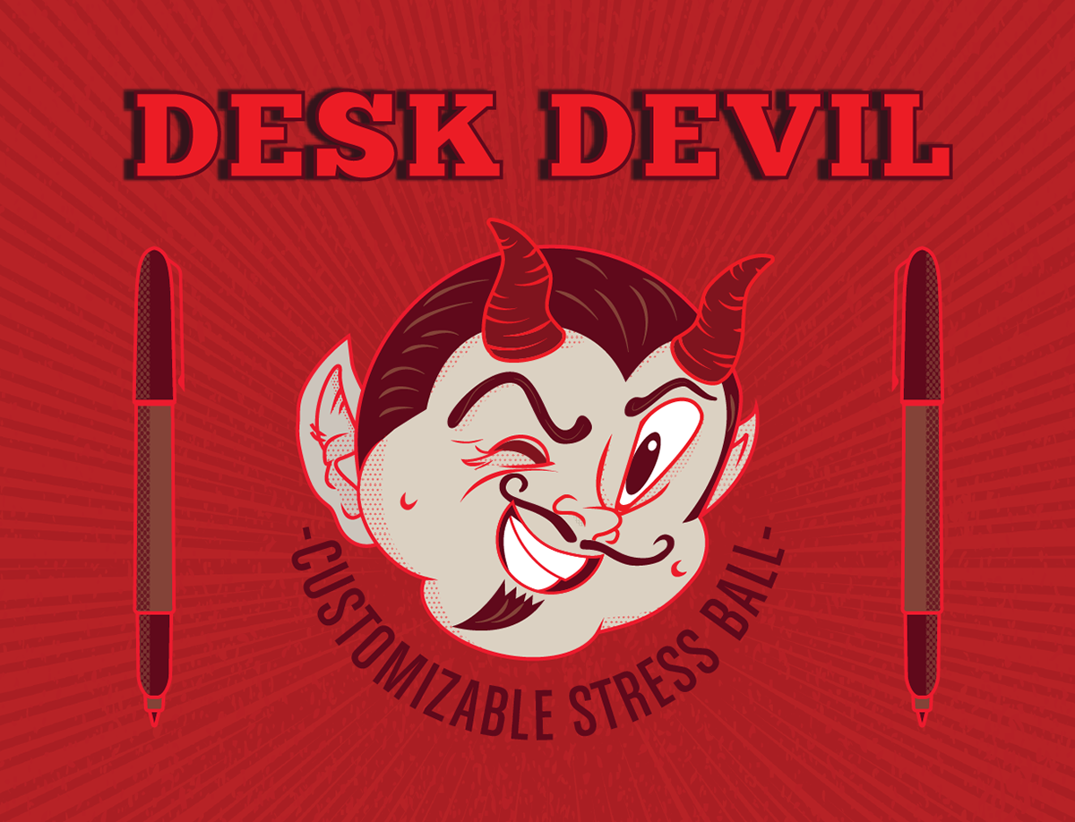
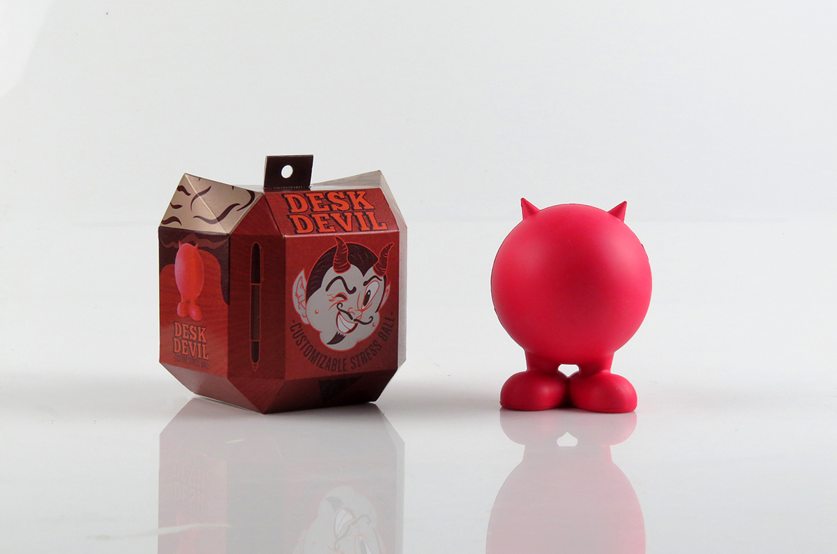
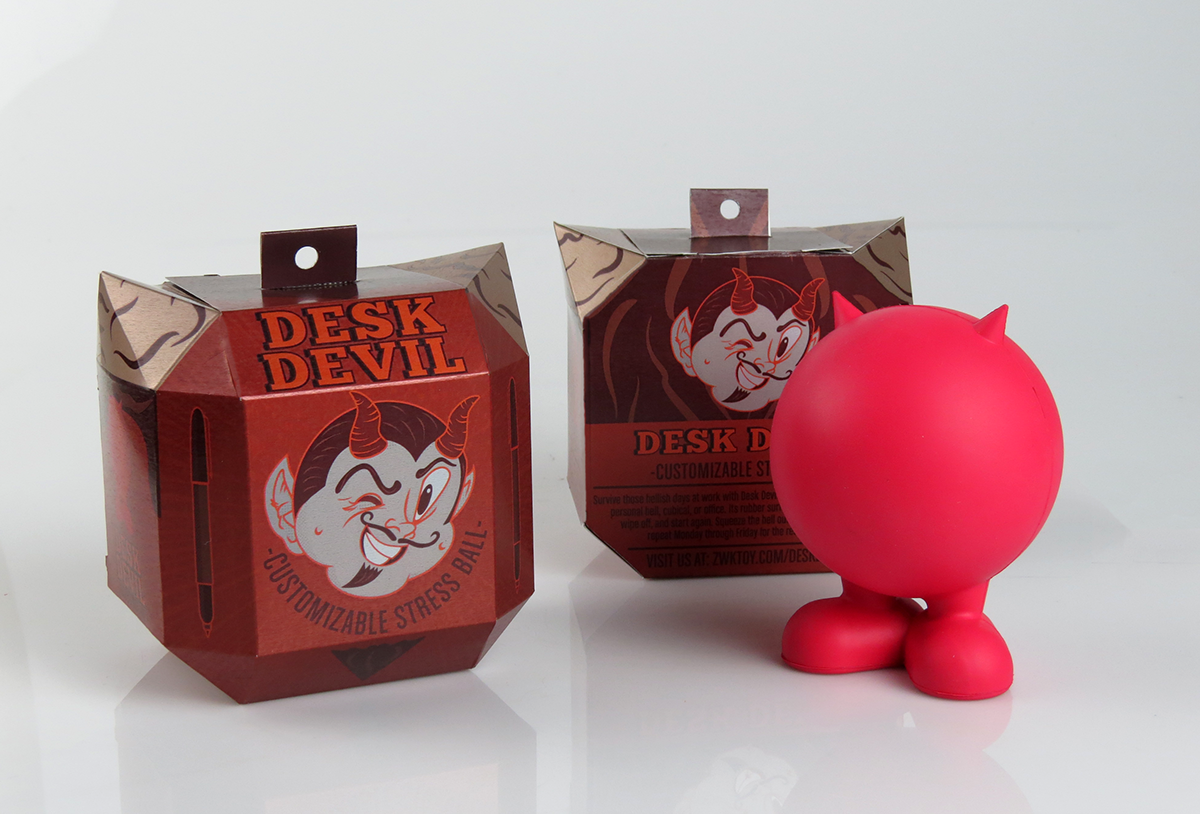
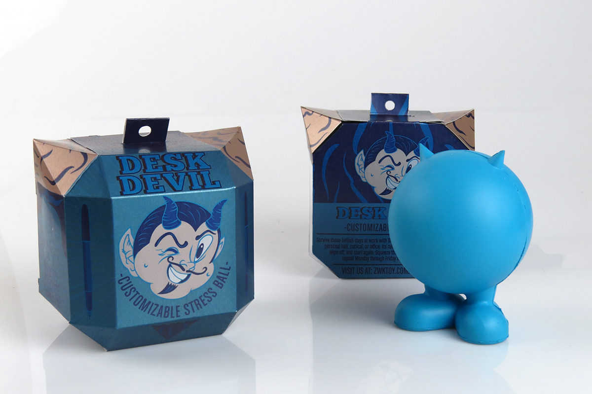
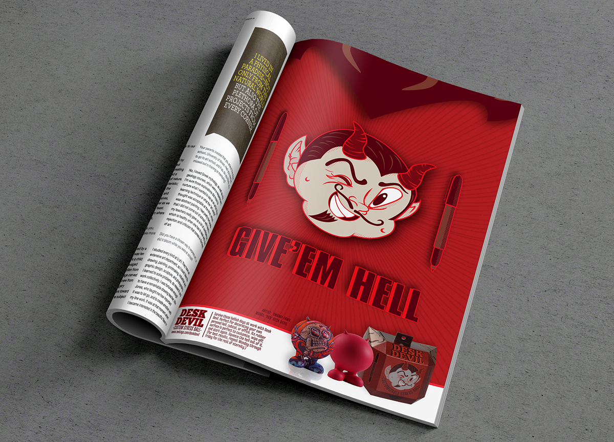
Desk Devil
PACKAGING DESIGN
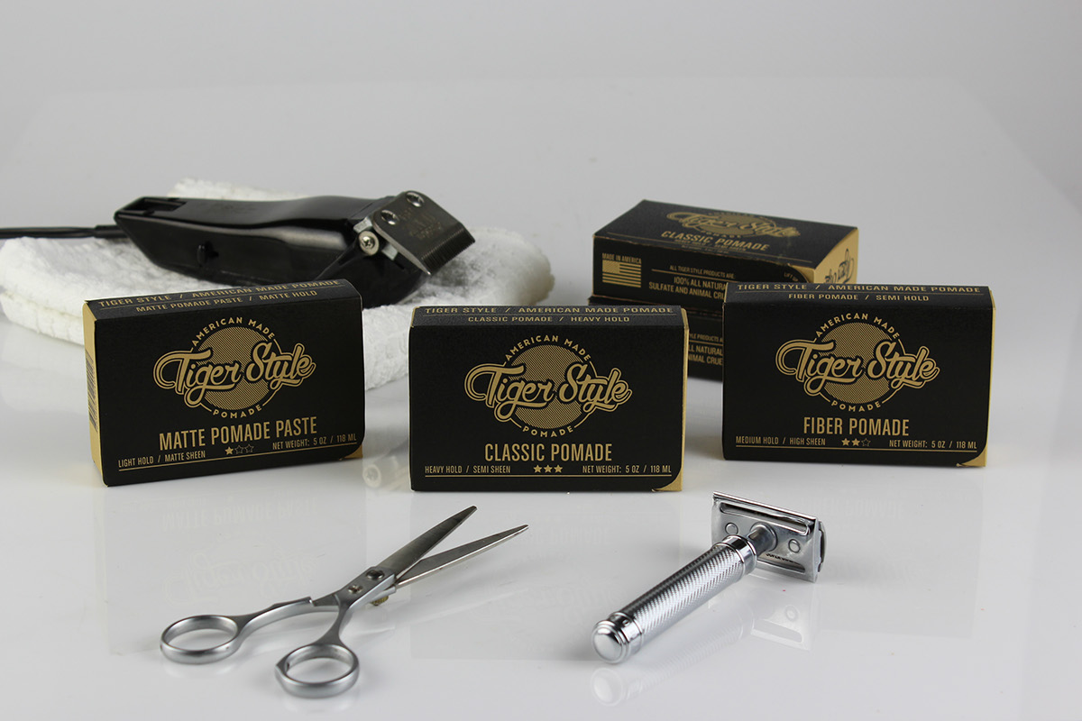
Tiger Style
PACKAGING DESIGN
Dr. Martens
ADVERTISING DESIGN
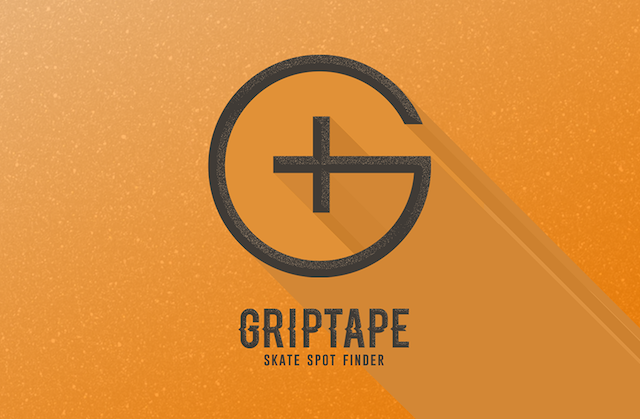
Griptape
INTERACTIVE DESIGN
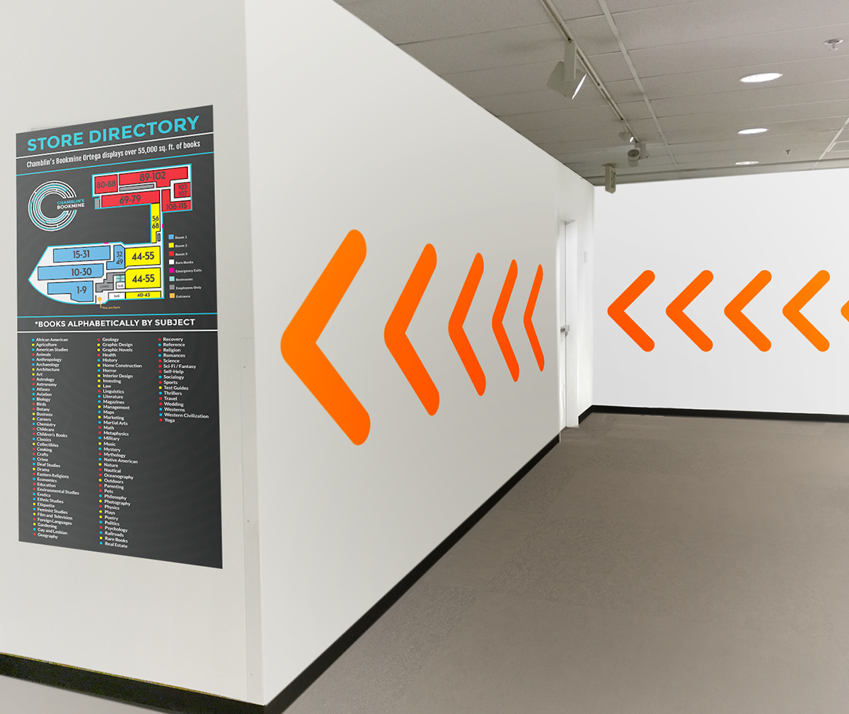
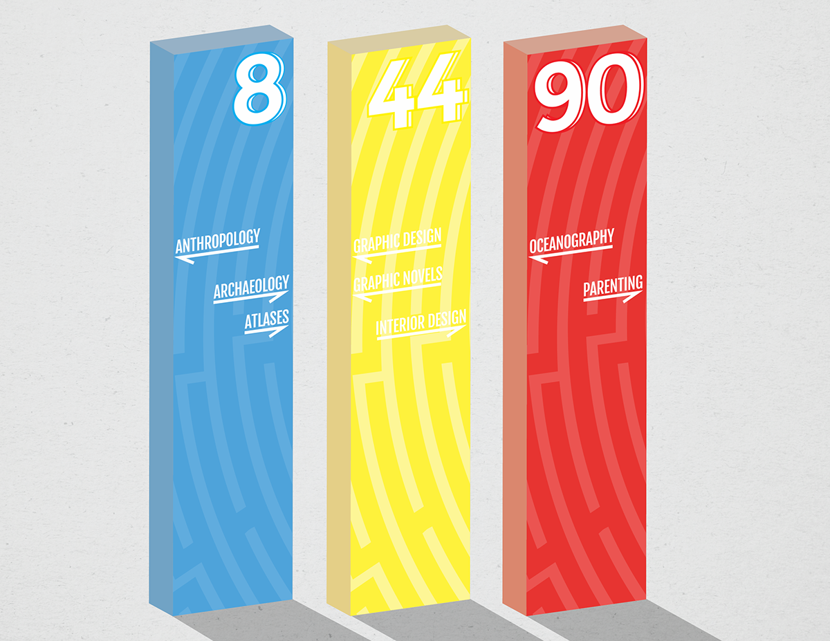
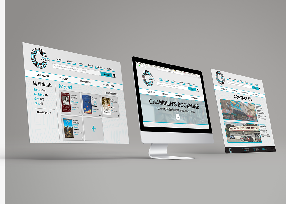
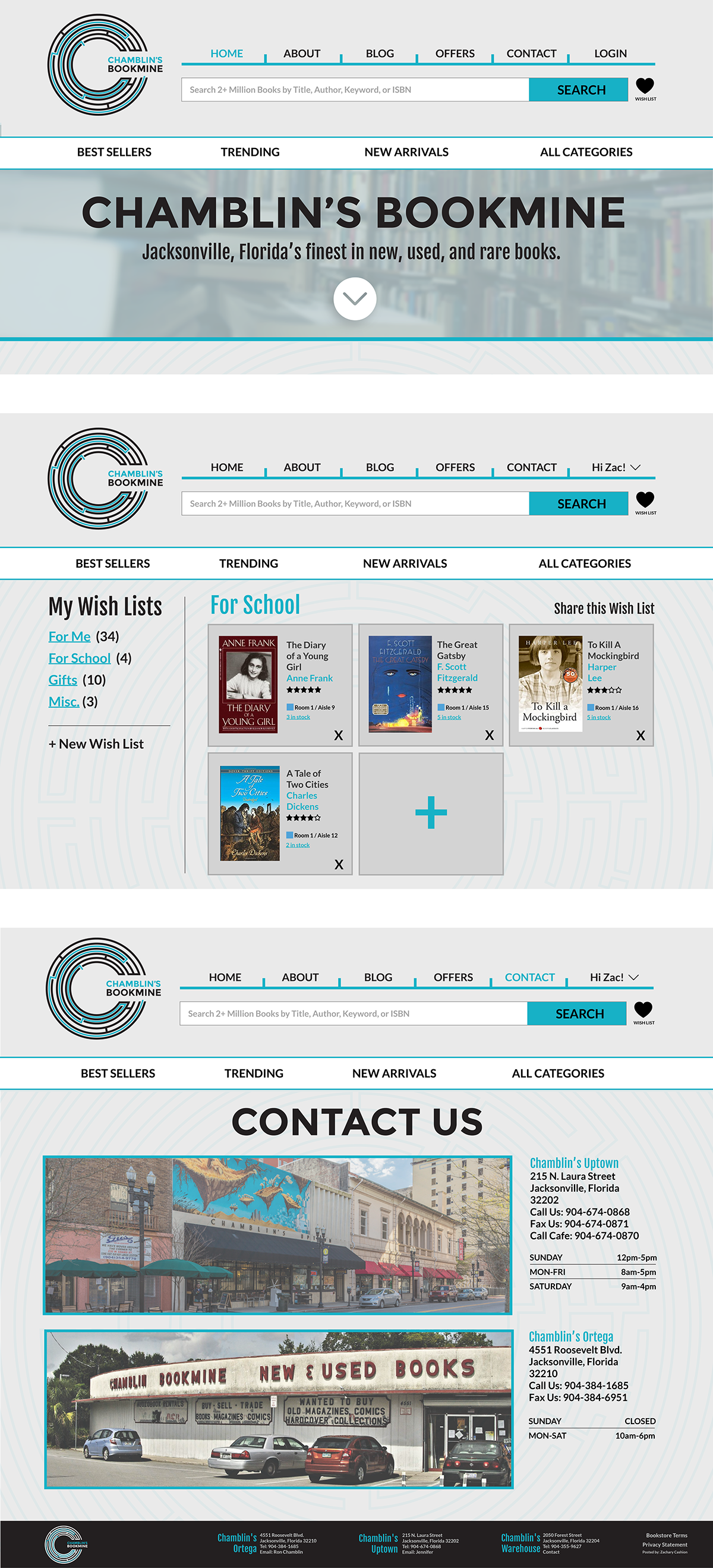
Chamblin's Bookmine
WAYFINDING
Lizard Kings
BRANDING
Riverside Map
ENVIRONMENTAL DESIGN
Southeastern Grocers
ADVERTISING DESIGN
Atlantic Beach Brewing Company
BRANDING
Spork
Branding
Miscellaneous
EVERYTHING ELSE
Contact
Like what you see? Drop me a line below.
Desk Devil
BRANDING // PACKAGING // ADVERTISING
Date: Fall 2016
Category: Branding / Packaging
This project was designed to take a toy and rebrand it for another target audience. I wanted to challenge myself, so I decided to take a dog toy and repurpose for humans, specifically as an office novelty desk toy. I chose the JW Pet Company “bad cuz,” a squeak/chew toy for dogs that had the added benefit of standing on two feet. I saw the possibility to make it a marker/pen holder. With its glossy rubber exterior it made it easy to brand it as a customizable stress ball / desk toy. I drilled a whole in the top to fit the pen/marker, while the marker is intact it is able to squeak like it once did but without it, it remains silent. Dry erase markers are ideal and with a simple wet wipe you can customize, design, erase, and start over, making this the perfect office toy for the creative minded.
I wanted the packaging to resemble the toy, and be able to both stand independently, and hang from a tab. After many attempts and designs I created a package that resembled the toy, and highlight the horns of the devil. The package was printed on gold foil to highlight the areas that were lighter in color such as the horned peaks on the package, the eyes and teeth in the cartoon, and some of the radial lines that spread from the central imagery.A project mandatory was for there to be only one glue line, which made the intricate packaging rely largely on pull tabs, and sharp folds.
The design inspiration was taken from early cartoon branding identities such as Casper the Friendly Ghost, and Hot Stuff the Devil. I wanted to show a fun devil, more mischievous and playful in nature than demonic or horror like. The color palette came naturally with red being both the color of the toy and “devils” in general. The widows peak in the hair line of the devil cartoon was mimicked into the geometric shape, including the goatee. Sharpies were included in the quarter panels to help frame the face of the winking devil cartoon. Subtle halftones were used to make the toy bridge the gap between modern and vintage design.
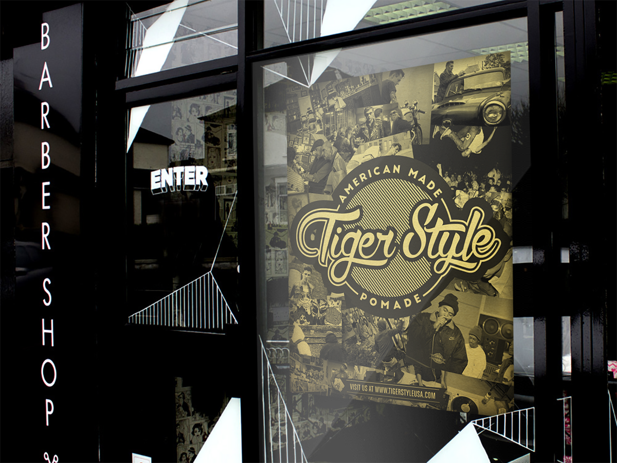
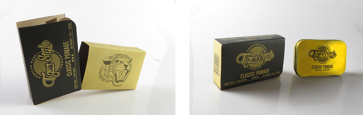
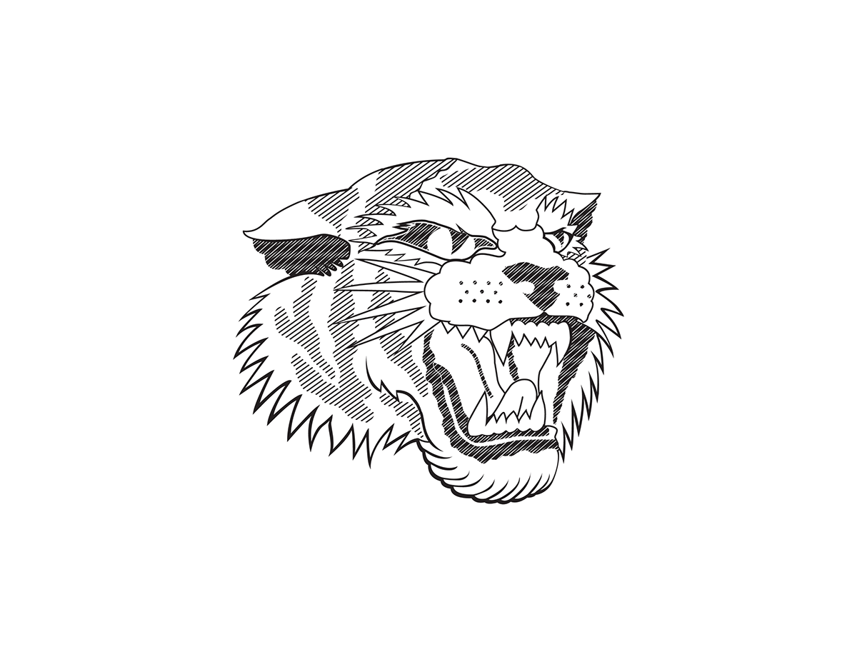
Tiger Style
BRANDING // PACKAGING // ADVERTISING
Date: Fall 2016
Category: Branding / Packaging
Tiger Style is a mens hair care and lifestyle brand, specializing in pomade. Tiger Style portrays an image unlike any other in the industry, meshing 1950’s barber shoppe aesthetic, with early 1990’s urban, hip hop lifestyle. The tagline for our pomade is “American Made Pomade.” We take pride in our American roots. From the pomade to the container that holds it. Tiger Style is selling an image as well as a product.
Logo: The Tiger Style Pomade logo is deigned to show its roots in a traditional barber shoppe fashion, but with a little more edge and 1990’s urban, hip hop lifestyle feel to it. The logo sports a script typeface, typical to see in the pomade industry, and a design that feels vintage. The script used has a hint of hand style graffiti lettering to it, to make the brand stand apart from its competitors. The stripe pattern in the background are in reference to the stripes on a tiger, although not directly. The stripes draw motion against the natural flow of the script typeface, grounding and centralizing the viewers eye.The tagline ”American Made Pomade” is simple, modern, and patriotic. The design isn’t over powering, yet still eye catching, and feels both modern and vintage enough to draw interest.
Packaging: The packaging differs from other pomades or mens hair car products in general. Typical pomades come in a circular container, while Tiger Style comes in a rectangular container. Exterior packaging is also rare. The idea behind the packaging was to emulate a Zippo lighter.
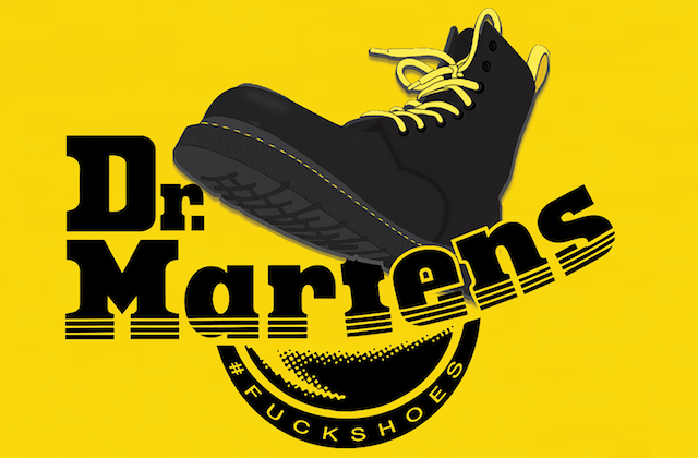
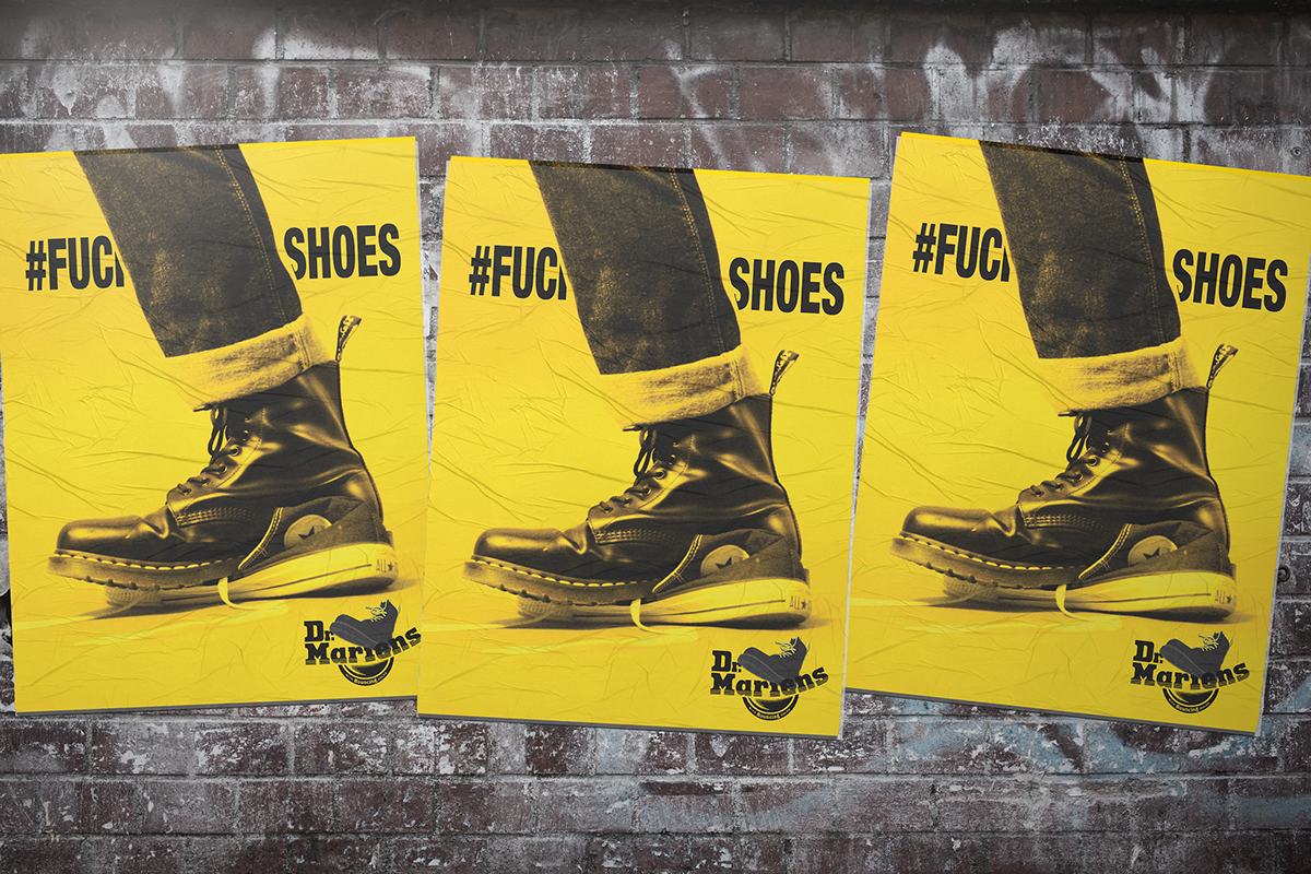
Dr. Martens
BRANDING // PRODUCT DESIGN // ADVERTISING
Date: Fall 2016
Category: Advertising Design
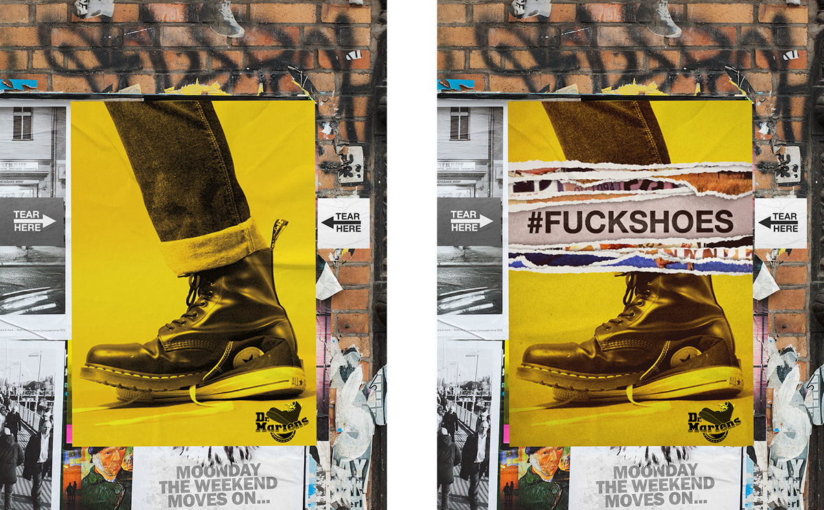
The choice to take such an edgy stance on the competition is attempting to harness the attitude that the Dr. Martens portrays. The imagery of a Dr. Martens boot stomping a shoe, paired with the hashtag “#FUCKSHOES” conveys an undeniable show of power over its opposition. Hiding the “K” in the word “FUCK” was planned so that the viewer still gets the idea of what is being said, while maintaining a level of discretion that allows the ad to move into more mainstream mediums. Keeping the ads consistent across all fronts, in the sense of message, composition, and color, was carefully orchestrated to be bold, eye catching, and aesthetically appealing. The yellow associated with the stitching, and heel loop tag on all Dr. Martens boots are iconic, and a major element of the brand. Limiting the advertisements to a grayscale image with a hard “Dr. Martens yellow” overlay, was used to create contrast in the mediums that it would be viewed, and thus creating “stopping power” amongst its viewers. Other than the hashtag and the logo, the ad has no other verbiage. The image is the focal point of the ad, and is a statement on its own, due to its aggressive nature. Campaign Logo: The fuck shoes campaign logo is more of a general reimagining of Dr. Martens current logo. It shows a boot stomping over the traditional Dr. Marten logo. Its minimal change makes a large impact.
Print Ad: The print ads shows a converse high top shoe being crushed under the stomping force of a single black Dr. Martens 1460 Boot, bearing the hashtag #FUCKSHOES. The aim of the print campaign was to get potential customers to become aware of Dr. Martens, and also have them look up the hashtag across social media platforms.
Wheatpaste / Interactive Poster: The traditional advertisement is wheatpaste postering, Dr. Martens demographic tends to be younger, and residing in a more urban environment. The choice to use wheatpaste posters over traditional poster advertisement was to make the campaign feel “gritty” or “punk.” The target audience would respond well to a more guerrilla type of advertisement, and would gain more attention toward the brand and hashtag. This type of urban advertisement panders to our target audience more than a traditional print and signage mediums. The interactive wheatpaste poster encourages human interaction. Several layers of posters are pasted to the wall with the instruction of “tear here” given to the audience. As layers are ripped away from the poster it creates collaged effect, while eventually uncovering the final page bearing the hashtag “#FUCKSHOES” This was chosen because it is reminiscent of early urban street art, which appeals to our core demographic.
Boot Box: The Boot Box is a box that is special for this campaign. It keeps inline with the current brand look of Dr. Marten. The box has the campaign logo embossed in multiple places. It has a more modern label for showing the customer information about the shoe model and size. The belly band that wraps the box has a call to action with the harsh tone of the campaign.
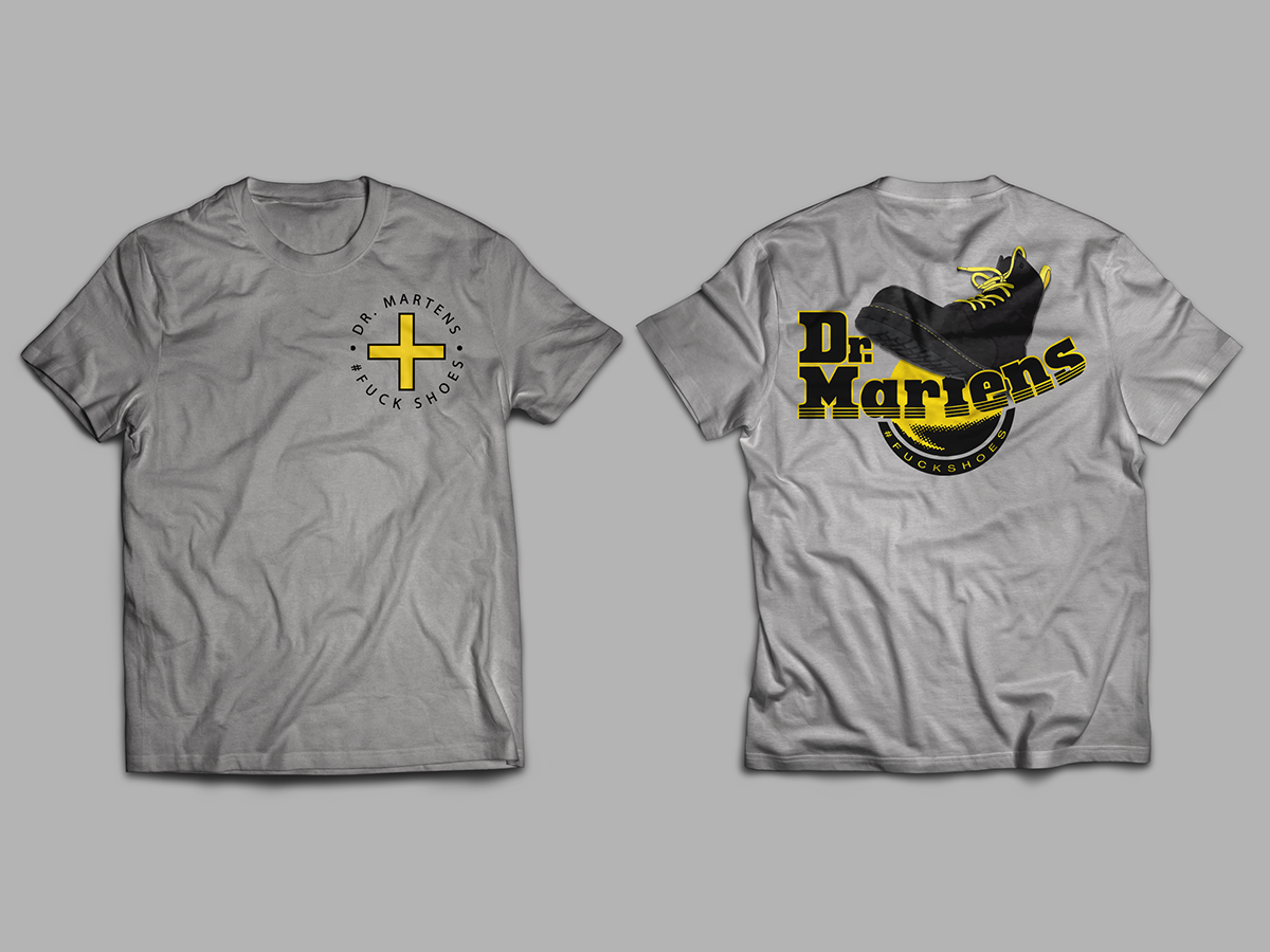
Merchandise: Dr. Marten lacks merchandise in general. The target market for this campaign appreciate the streetwear that comes with Dr. marten lifestyle. A minimalist t-shirt keeps in line with modern trends, as well as the enamal pin which have regained popularity recently. These items only let the consumer continue to promote the campaign while wearing providing a product that will create revenue.
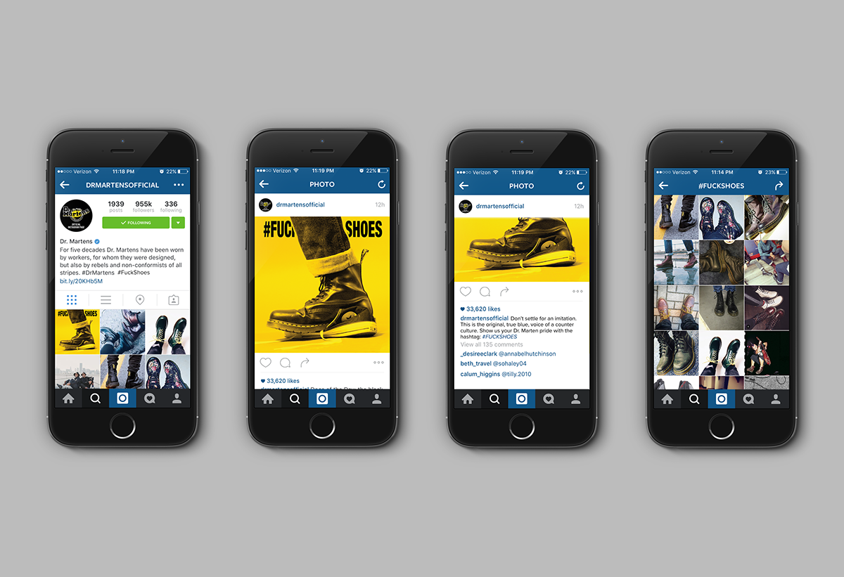
Social Media: The campaign highlights the hashtag “#FUCKSHOES.” Hashtags are exclusively used for social media, so the entire campaign is leading to them. Instagram was the chosen platform to showcase, but will work across Twitter and Facebook as well. The hashtag is a way for customers of Dr. Martens to show their brand loyalty. With this facet of advertising, the customer helps advertise the product while simultaneously leading them to Dr. Martens official social media pages.
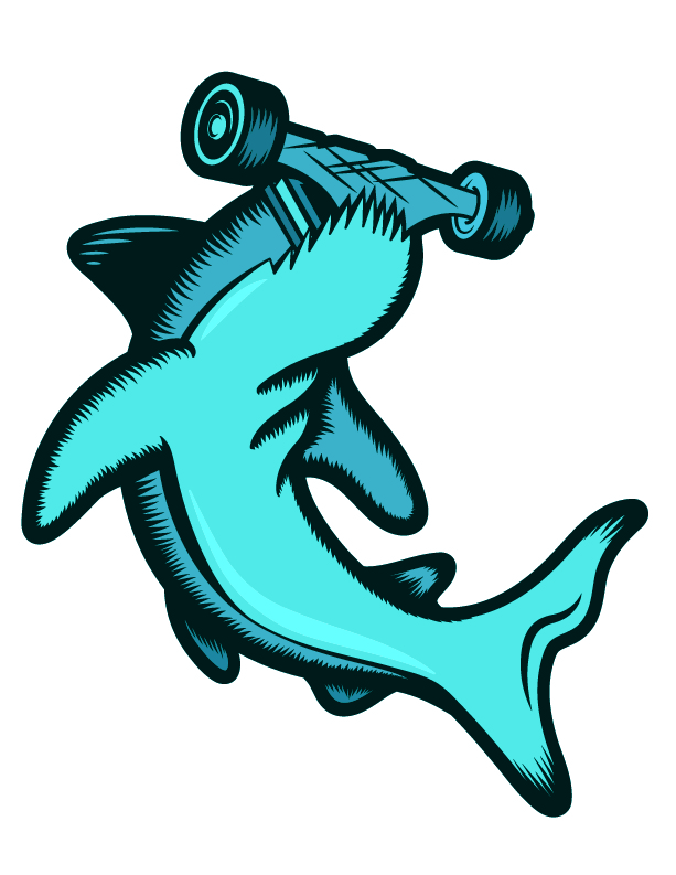
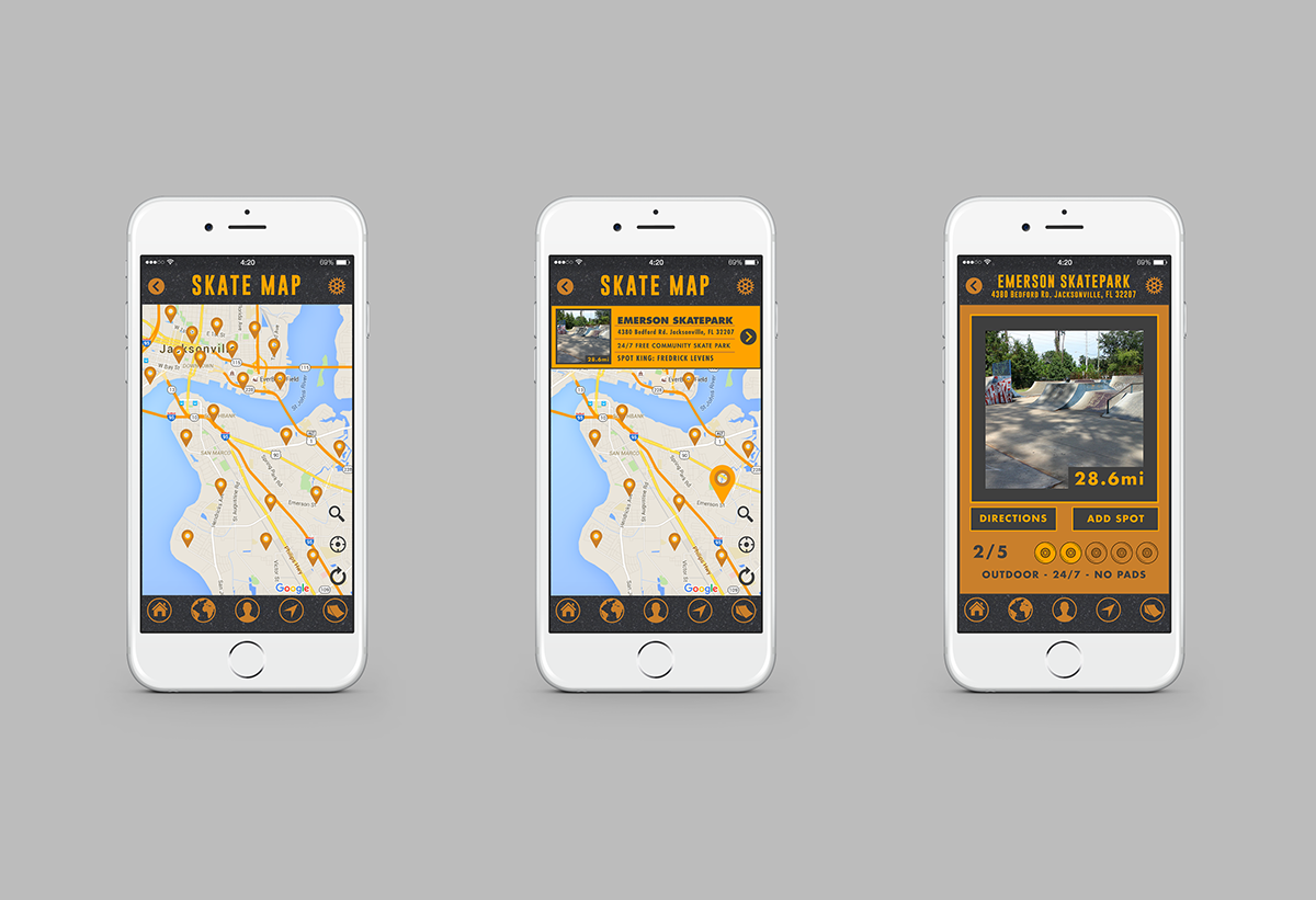
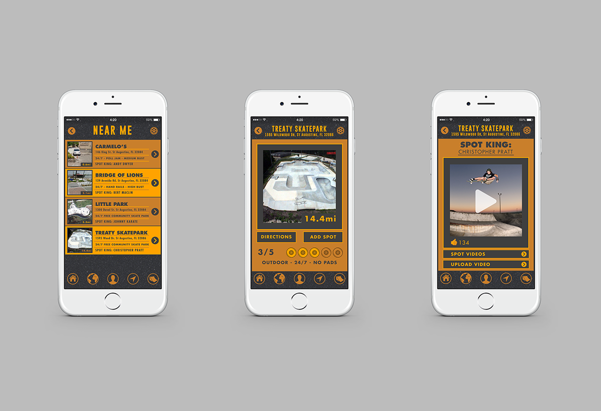
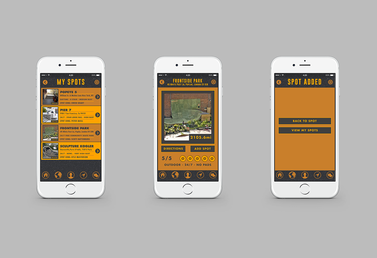
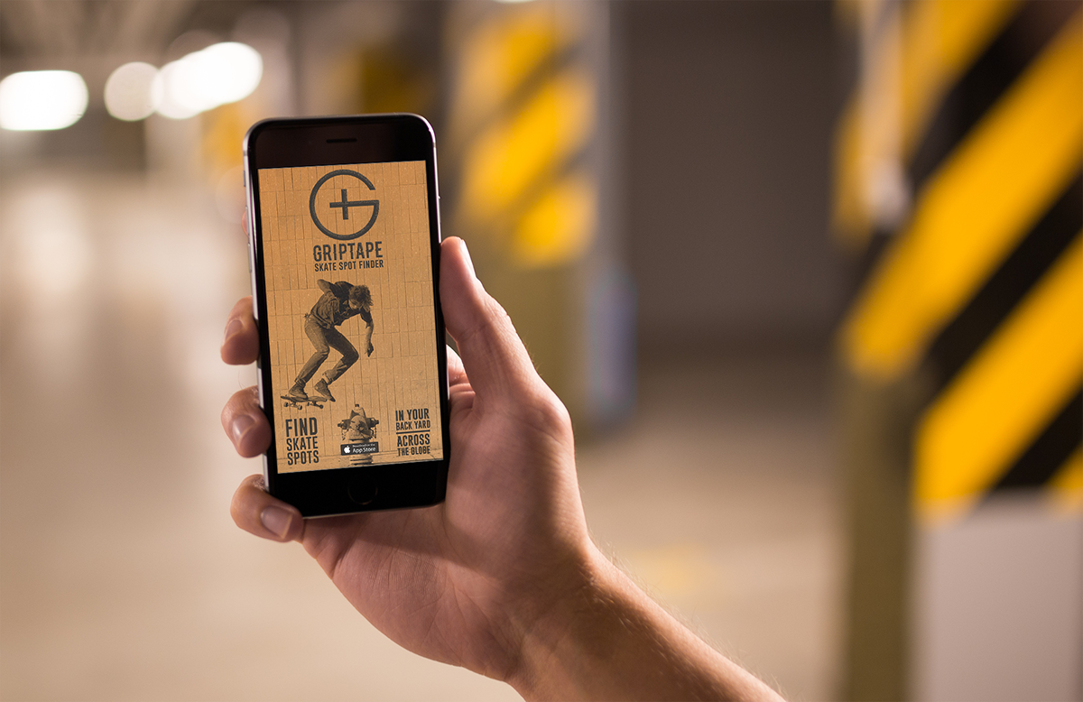
Griptape
APP DESIGN // ADVERTISING // INTERACTIVE
Date: Fall 2016
Category: Interactive Design
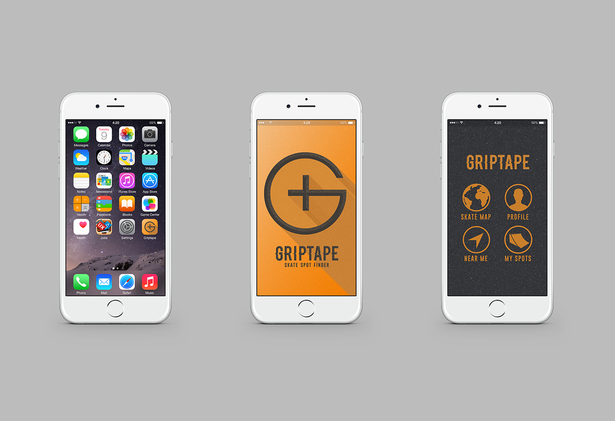
GRIPTAPE allows you to find and locate skate spots around the globe. Rate and rank spots and user videos to choose who is the spot king, or upload your own video to take a swing at the crown. With geolocation you can and skate spots near you, and make your own ‘spot list.’ From diy to skateparks, finding a great spot is only a click away. GRIPTAPE uses geolocation to show areas around the user and direct them via map or proximity. It is pseudo profile based in the sense that it houses your video uploads if you choose to have one. The ultimate goal of the profile based system would be to become a ‘spot king.’ Users rate uploads as well as the spots themselves, and decide whom has captured the best trick at that location. The design was made simple and bold. It is easy to navigate in a hurry, “Thumb friendly,” and aesthetically appealing to those who want to browse its content.
Chamblins is a bookstore located in Jacksonville Florida, with two locations, a warehouse and online shopping. This 40 year old business has no brand unification. The challenge of this project was to bring structure to the brand while solving navigation and organization issues with both interior signage, and web and mobile platforms.
The stores are stacked floor to ceiling with books, and a lack organization. To make shopping easier on the customer new wayfinding signage, website, and mobile app were created. The design centers around the idea that the store is a maze and that idea is used in the new logo, and as a repeating element the other components. To enhance brand recognition a new name structure was necessary, “Chamblin’s Bookmine” which was used for one of the retail stores, will now encompasses the entire brand.
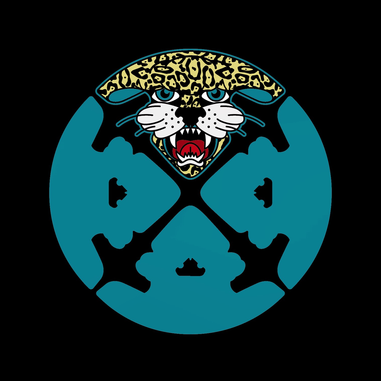
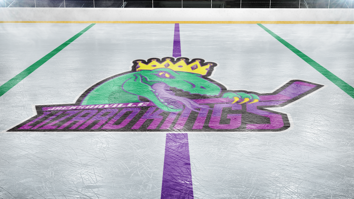
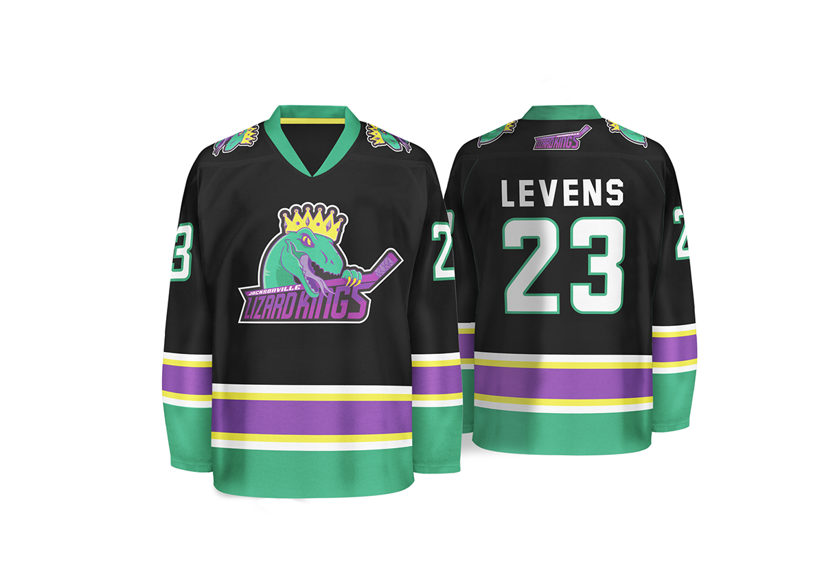
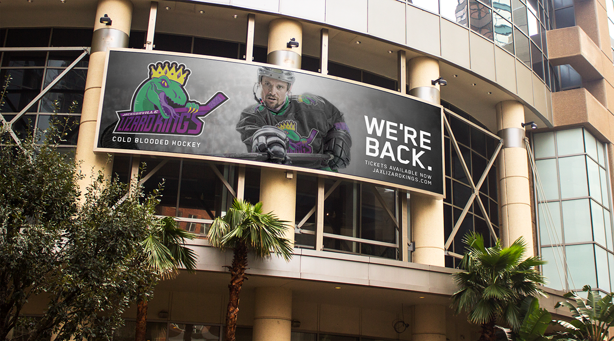
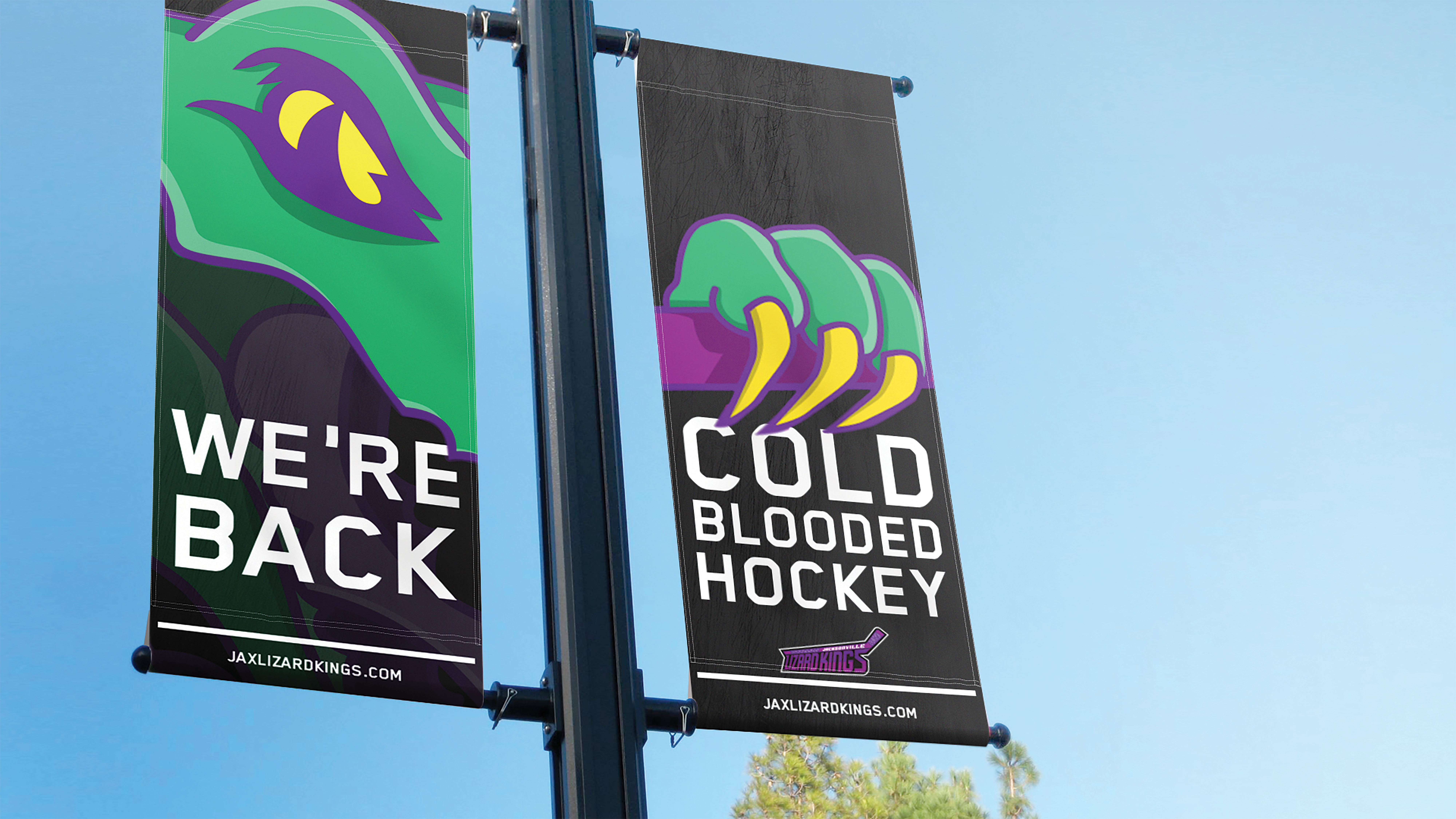
Lizard Kings
BRANDING // PRODUCT DESIGN // ADVERTISING
Date: Fall 2016
Category: Graphic Design
The Lizard Kings were a minor league hockey team in Jacksonville, Florida from 1995 to 2000. The beloved team leaves behind a lot of memories to the people in the area. This campaign is a nostalgic approach based on the idea that the team came back to Jacksonville. A complete rebrand pays homage to the original team colors. The logo design was made to be nested, so separate parts could be pulled and used independently. The new logo(s), uniform, and advertising campaign were created to generate buzz around the return of “Cold Blooded Hockey” to the Bold new city of the South.
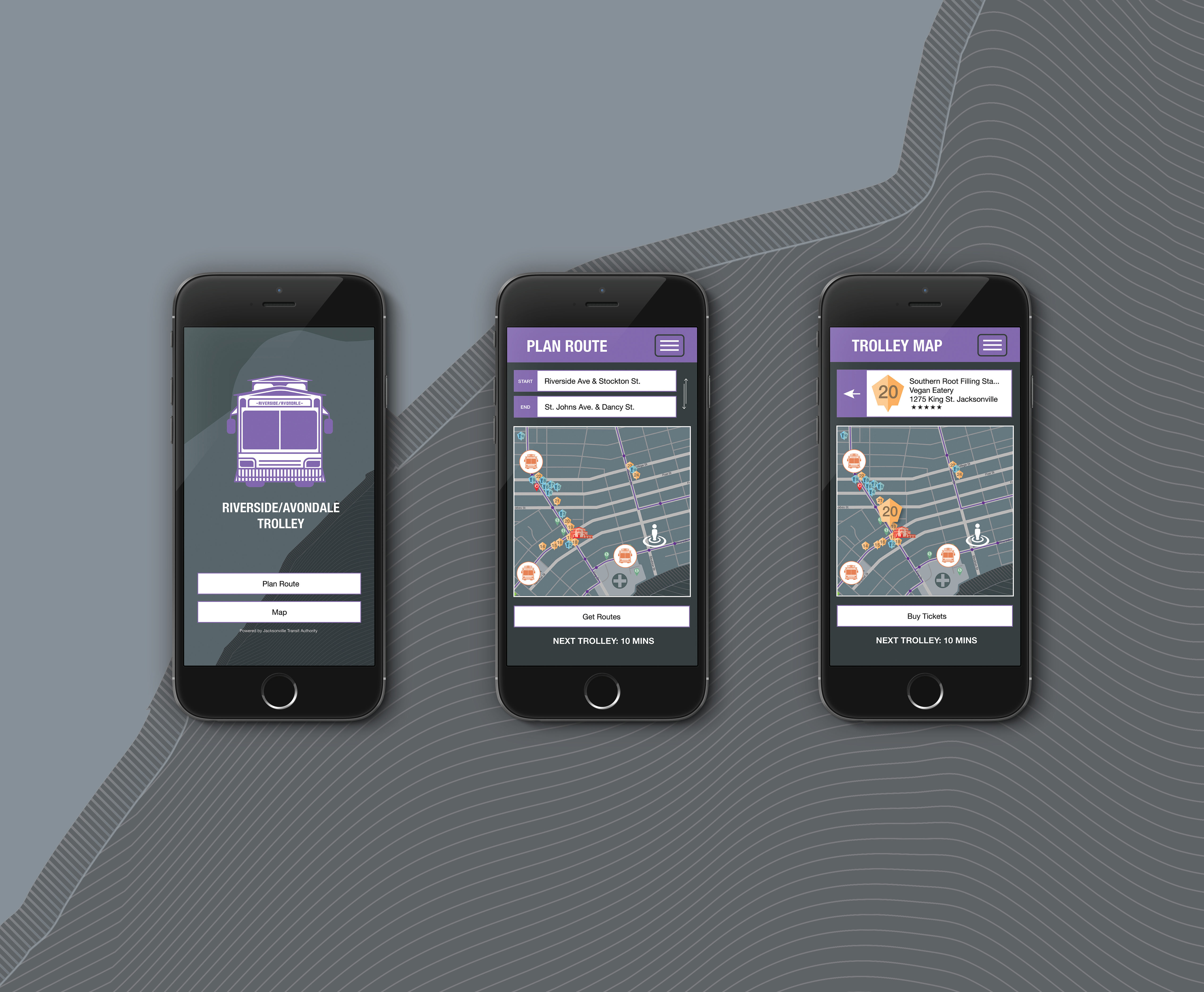
Riverside Map
BRANDING // ENVIRONMENTAL // WAYFINDING
Date: Fall 2016
Category: Graphic Design
Jacksonville, Florida’s Riverside Avondale neighborhoods have the city’s best, and most eclectic nightlife, yet lacks any formal recognition, other than the historic Five Points area. This map illustrates the neighborhoods in their entirety, from the grid system of the streets to bars and restaurants that stay open late. The Riverside Avondale Trolley which is included, loops through the entertainment areas, detailing each stop. A mobile app has also been designed to connect consumers with the map.
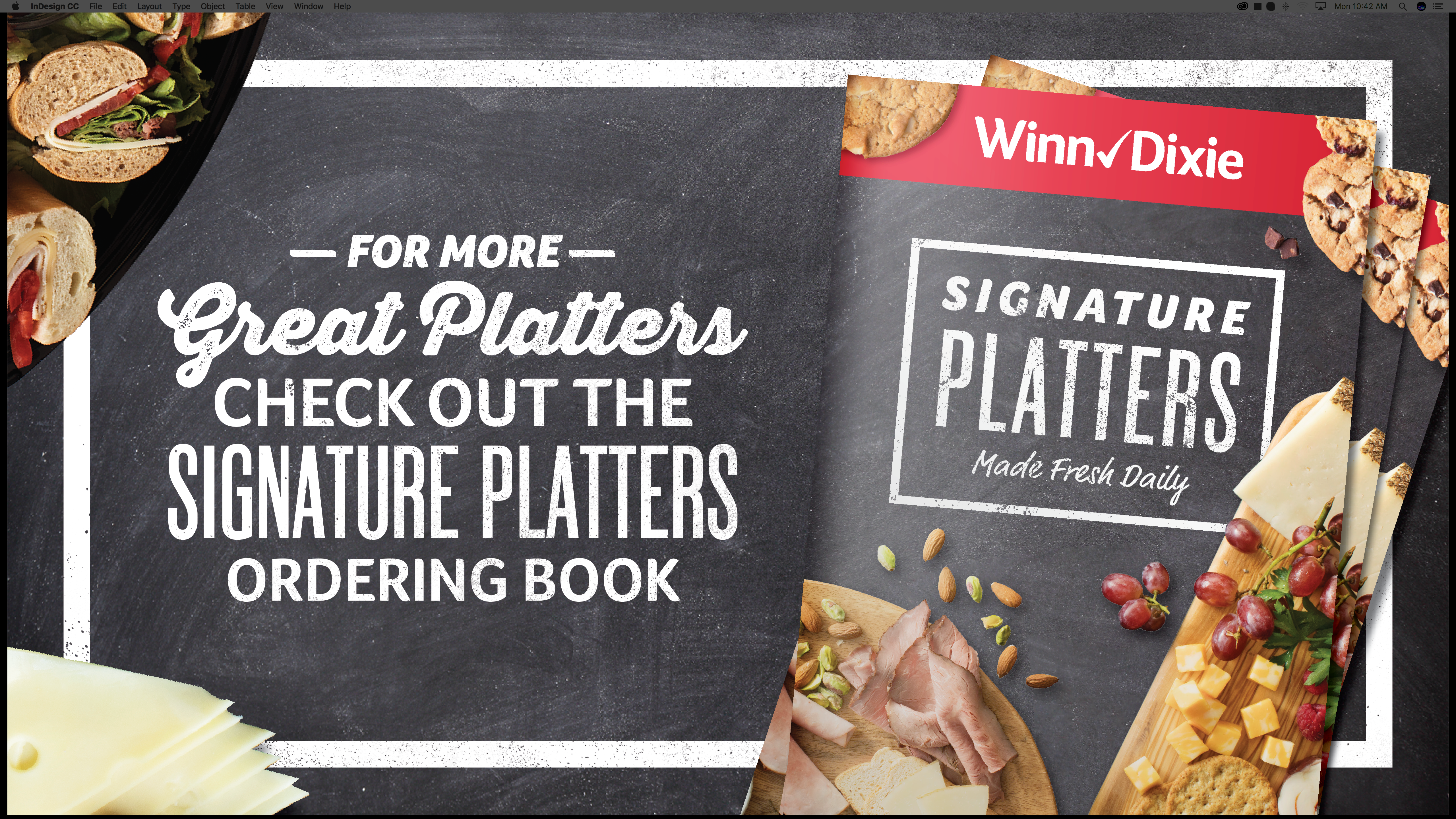
Southeastern Grocers
BRANDING // SIGNAGE // ADVERTISING
Date: 2017/2018
Category: Branding / Signage
more to come...
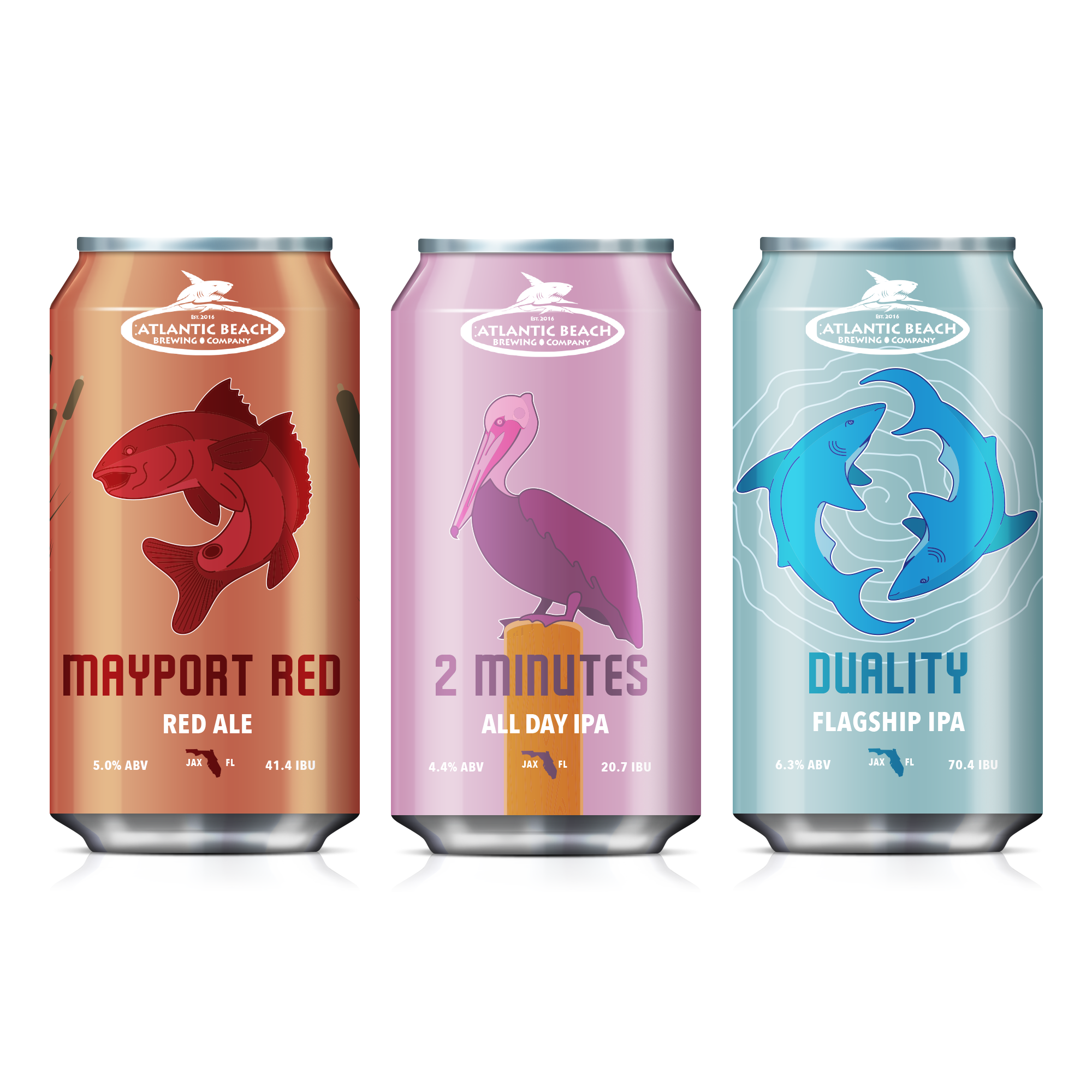
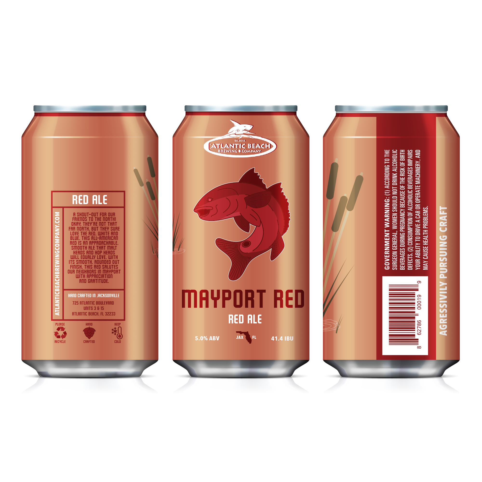
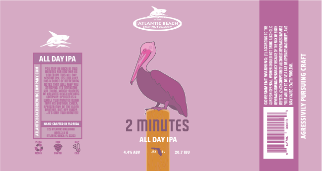
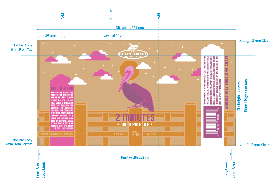
Atlantic Beach Brewing Company
BRANDING // PACKAGING
Date: Summer/Fall 2017
Category: Branding / Packaging
This project was an unused RFP for a small craft brewing company for Atlantic Beach Brewing Company
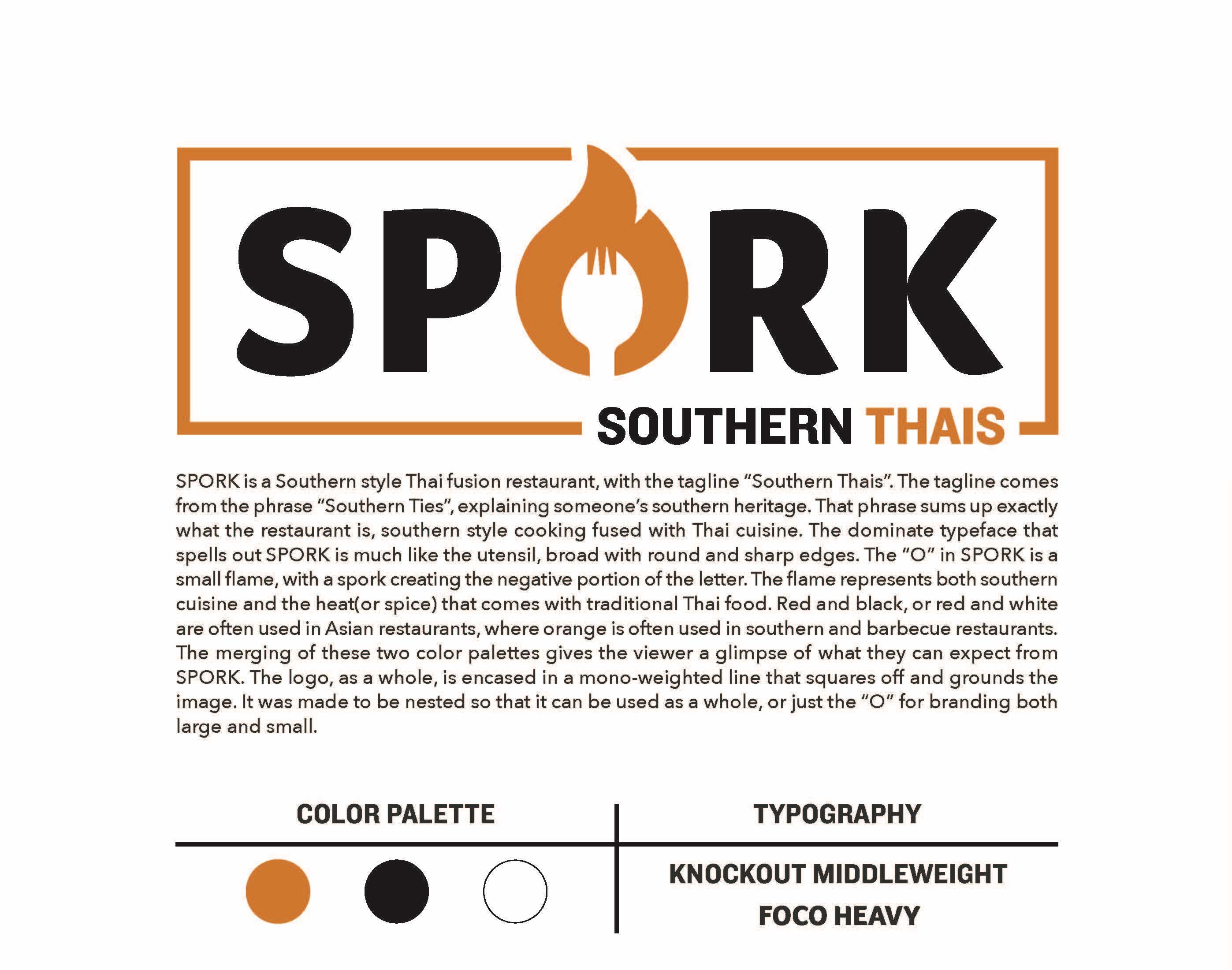
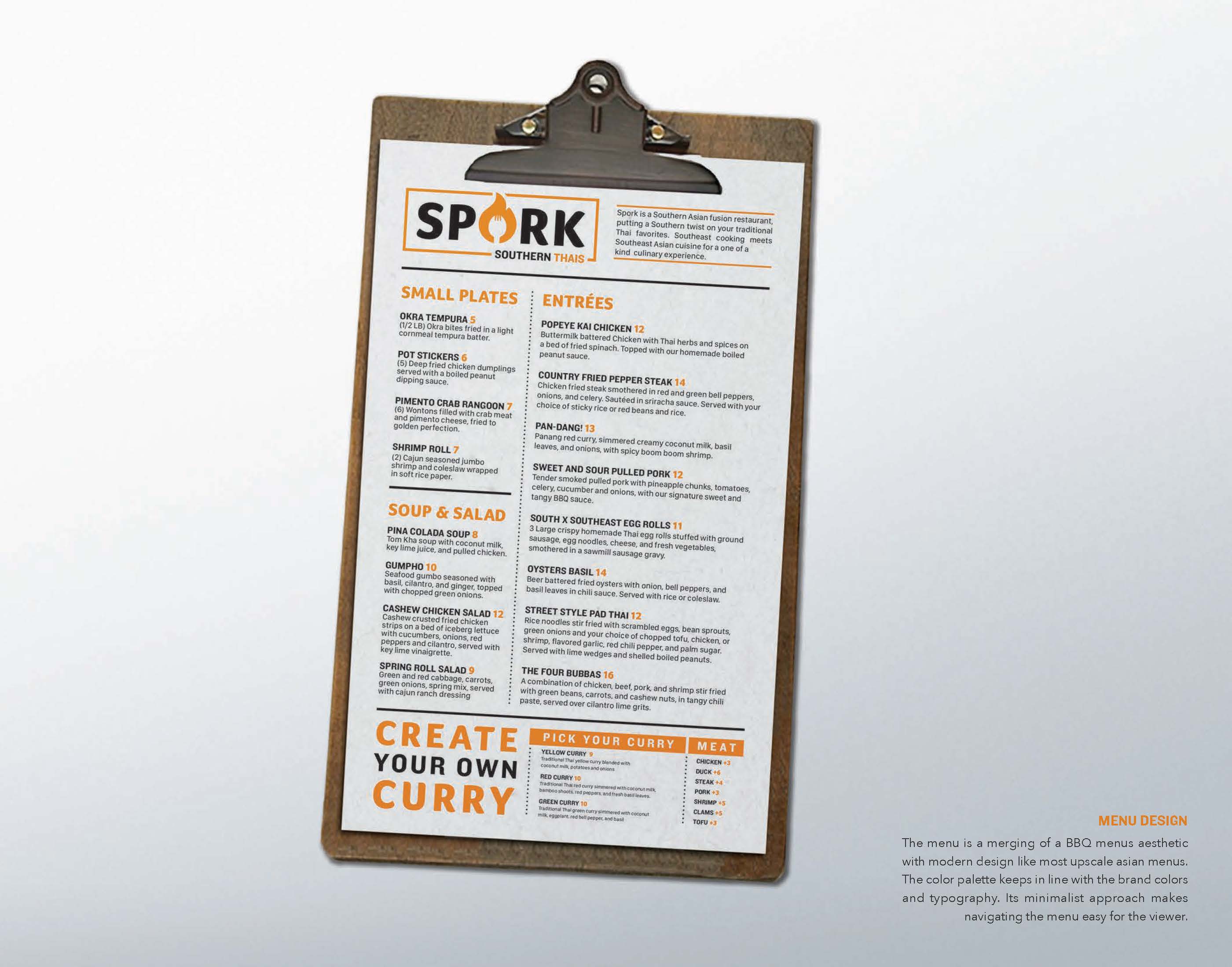
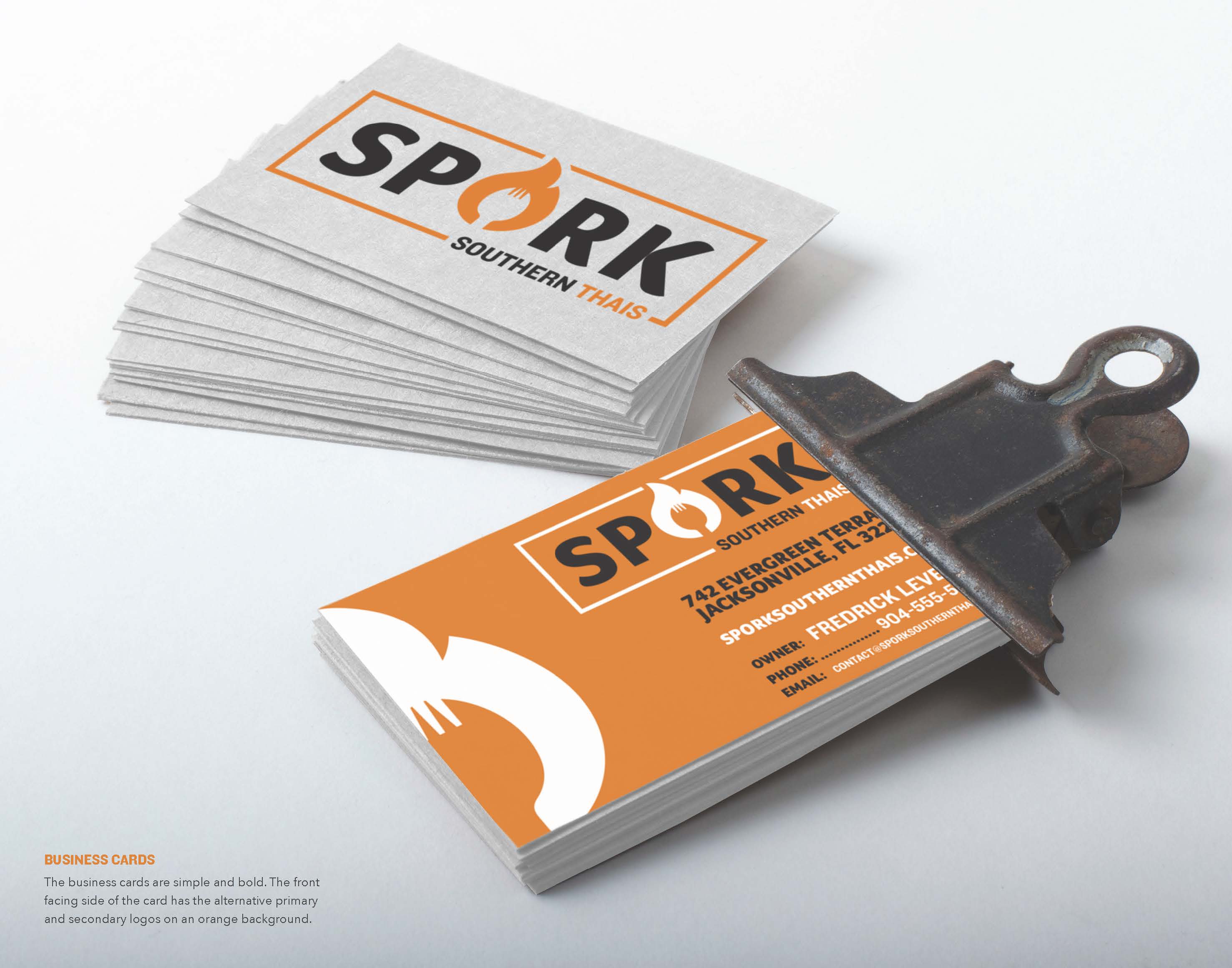
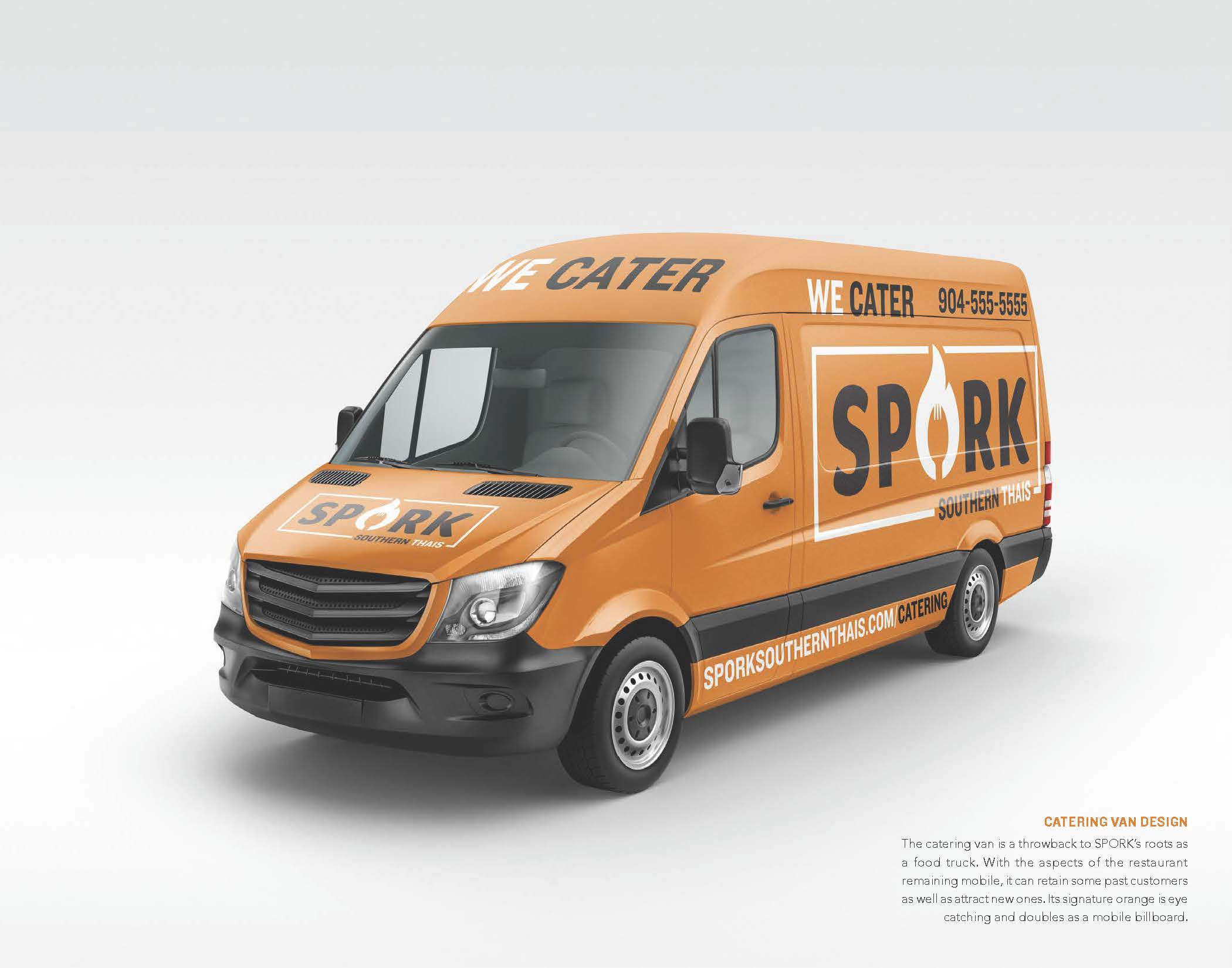
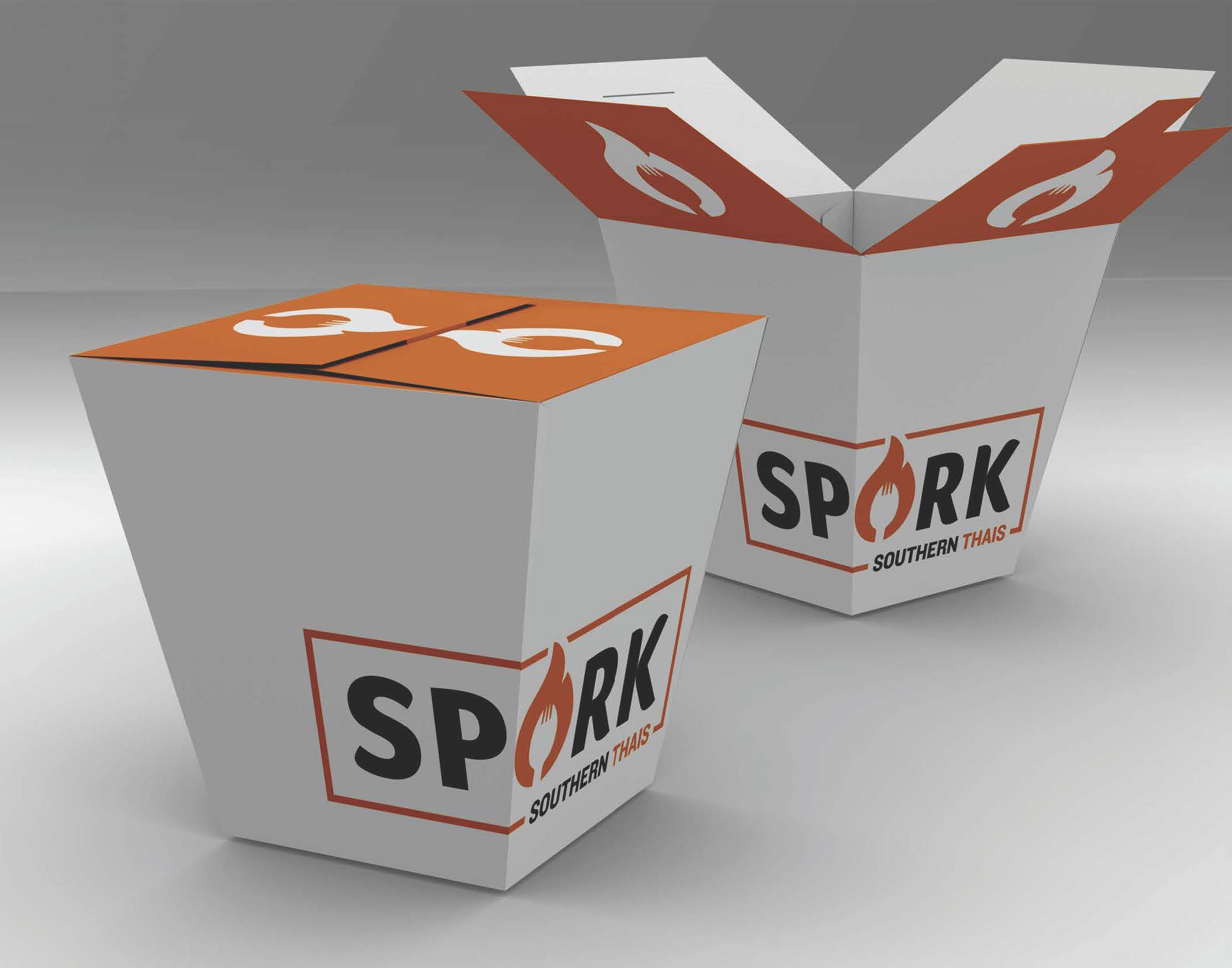
Spork
BRANDING // SIGNAGE // ADVERTISING
Date: 2018
Category: Branding / Signage
Ficticious project
MISC.
Everything else
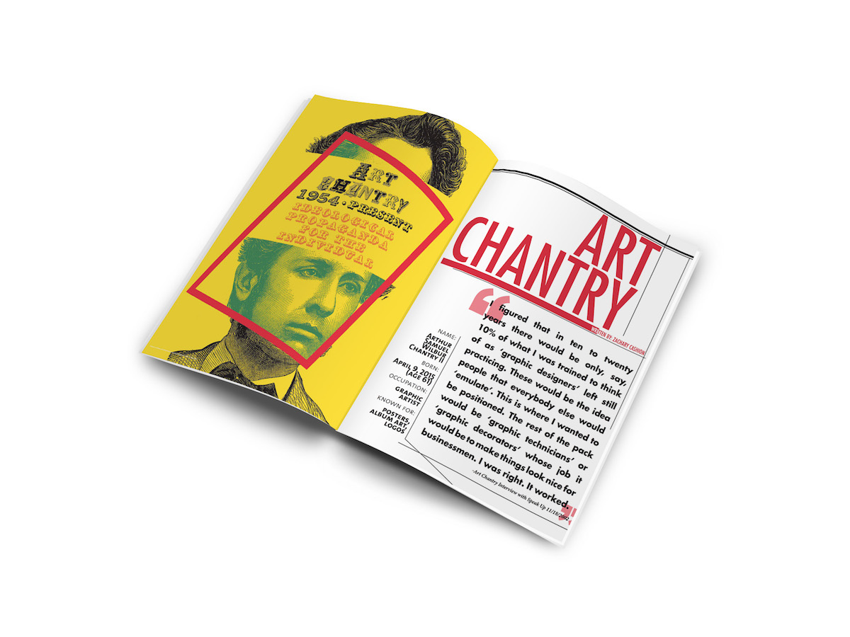
Editorial layout about Art Chantry
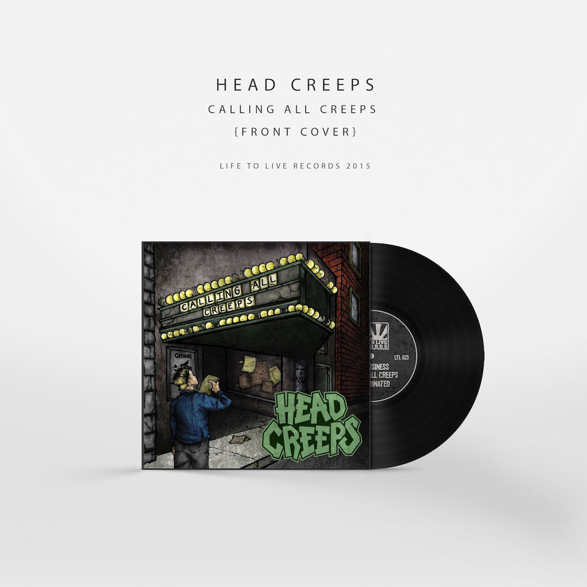
This is album art was created for Jacksonville 3 piece hardcore punk outfit HEAD CREEPS. This five song EP was released on Life to Live Records. Created by two of my friends (Alexander Barnes and Van Eggers) and I. This was my first time taking on a Creative Director position after the early stages.
The logo was created months before for merchandise and promotion.
The logo is still in use for the band, and plan to use it to continue on past this album.
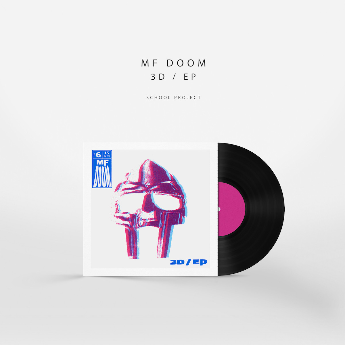
This is album art was created for an illustration class project. It is a hand pulled, two color, 3D screen print. It works with all standard 3D glasses. The project called to create a fictitious album cover for an existing and established group or artist. I chose MF Doom for my love of his work and persona, and felt like the idea for the 3D album cover donning his iconic mask is something that would be realistic for him to actually release. The label in the top left corner mimics a comic book cover stamp. I chose this because the MF Doom persona came from famous Marvel Comics “Fantastic Four” villain, Dr. Victor VonDoom. The name 3D / EP seemed like an obvious choice. The record is an EP and the Cover is 3D.
Various posters for various school and personal projects.
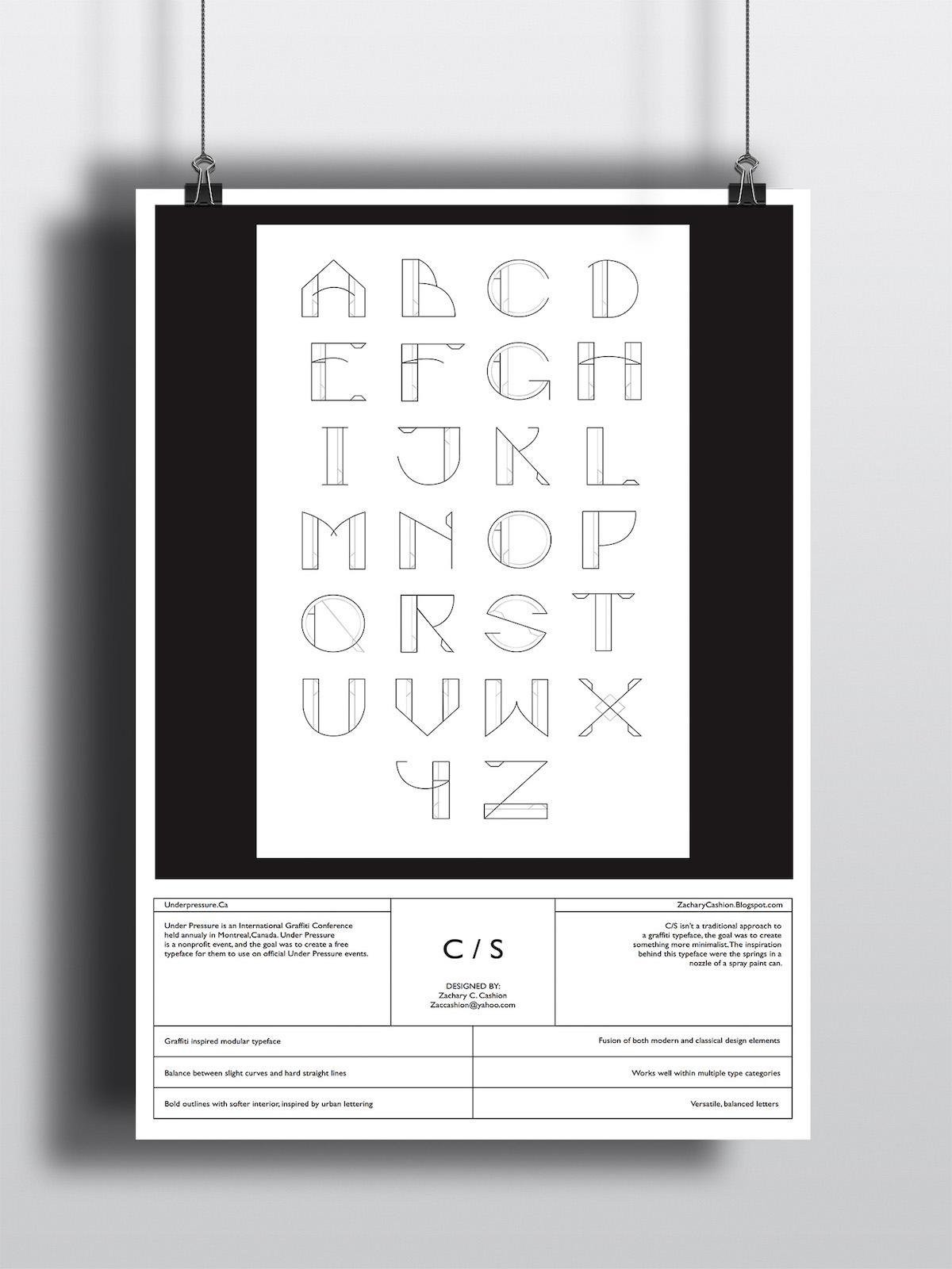
This is a modular typeface I created for a class project in February of 2015.
It was based of the components of a aerosol spray nozzle.
As of November 2016 it has over 24 thousand downloads.


 The poster was created for a ficticious event based on the typeface.